“Having photos sitting on our walls at home wasn’t doing anybody …
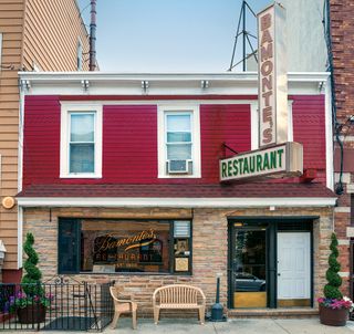
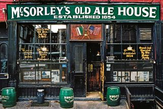
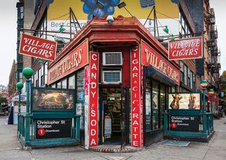
Cities constantly evolve to meet the needs of the people who live and work in them, but this inevitable evolution has its downsides. Local neighbourhoods full of character aren't immune to the grand plans of property developers and many small business owners - active in their communities for generations - are concerned about such 'progress' and what it means for them. With many beloved 'mom-and-pop' store frontages disappearing from New York City's streets, photographers James and Karla Murray decided to document them for posterity.
Their best photos appear in their book Store Front NYC: Photographs of the City's Independent Shops, Past and Present, published by Prestel Verlag.
We speak to James and Karla about their ongoing project, and meet two owners of the stores that appear in the book, to hear their side of the story.
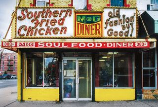
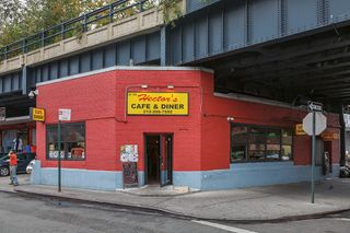
How did the book come together?
Karla Murray: It was born from an entirely different project. We were documenting graffiti art and, in the 1990s, these mom-and-pop stores became almost parallel to graffiti. Graffiti is a temporary art form so it's important to document it when you see it and we began to notice that a lot of these small places, even in the early 2000s, had started closing.
James Murray: We had collected this vast collection of film photos and I remember the day the editor for the graffiti book was over at our house. We were editing the book and we had photographs of a bunch of storefronts in long strips on our wall. Karla: He happened to glance up at our wall and asked "What's that stuff?", and we said it was just mom-and-pop stores in New York.
He was from California, so we didn't think he'd have any interest in what a store in New York was like. He asked us to take one of the strips out of the frame and started folding the photos into the book. He asked if we had any more pictures like these and we said there were thousands, which we'd put in a shoe box.
The editor also asked whether we'd spoken to the owners of the stores about taking photos of them, and so I pulled out this huge box of tape recorder cassettes with all our interviews. I told him that interviewing the artists was something we did when we photographed the graffiti art. He then cleared the table and said that the storefronts should be our next project.
So that's the genesis of the Store Front NYC project. It began as a total labour of love - we were just documenting it for ourselves.
How did the store owners react to you photographing their storefronts?
Karla: We always interviewed the graffiti artists because we were interested in why they would pick their tag [their alias as a graffiti artist] and what attracted them to graffiti in the first place. We would ask people questions and get little stories about the photos even though we weren't sharing them with anybody.
It's just something that we really like to do. We found the store owners had so many interesting stories to tell - the pride they had in their stores was incredible. First of all, they were amazed that I was interested in taking a photo of their store because a lot of them said nobody had ever done this before, at least not to their knowledge.
Maybe somebody did take a photo of their store, but they didn't go inside and introduce themselves and tell the owner why they wanted to take a photo. But what we would do is introduce ourselves and most of the time I would ask to take a photo of the outside of their store. They would look at us with a puzzled look and say, "What's so great about it?
It's just my store." I would reply that it was gorgeous and their face would start beaming, then they might say they were considering getting rid of the storefront sign if it was an old hand-painted sign that was fading away. I would tell them that the sign was fabulous and they shouldn't get rid of it, and it was the reason why we stopped and were talking to them now.
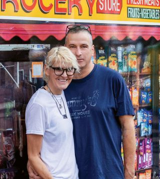
Then I would ask them questions like how long they had been in business, how long it had been in their family and whether they had any interesting stories. We were hearing the pride and joy they had in their stores and that gave us the motivation to document the store as best we could.
Which cameras did you use to shoot the photos, and did you have a consistent setup?
Karla: No, we didn't. When we first started shooting the storefronts, we had an inexpensive Canon Rebel, before upgrading to a semi-professional body.
They were always Canon cameras because we would just upgrade the body and use the same lenses. But it was never about the equipment, because we didn't have a lot of money to buy things. I would say most of the storefronts were photographed with a 28mm prime lens, and later on, we went with a 20mm.
As you can see from the photos, there are no obstructions in front of them but that wasn't the reality. When you went to photograph a storefront, you could get there and there would be a big van or a box truck parked in front of it, or a tree growing on the edge of the sidewalk, a phone booth or parking meters. There were all these obstructions that we didn't want to include in the photos, so the 20mm lens was something we purchased later on to help us achieve that.

Presumably, there were many early starts and lots of having to wait patiently for the right conditions...
James: The light was important to us because you can see that, for the most part, it looks pretty uniform.
We would generally look at the weather forecasts beforehand and we didn't mind the rain, but if it was really pouring, then the rain would show in the photo. So we didn't mind there being light rain or drizzle, but we couldn't shoot in full-on rain because it would put too many reflections in the window. Karla: Sometimes, if you look at a photo carefully, you'll see James or me or even our dog, because we'd always take our dog with us as well.
James: Light was the biggest battle, I would say, then traffic and parking and even people. Karla: It was a conscious decision early on to not include people in the photos for the most part. James: We wanted to give the impression of just the viewer standing in front of the store and encountering the hero of the photo.
We would come across something amazing and be so excited that we wanted to convey that thrill in the pictures. There are a few instances where there is a person in front of the store, and it was usually the store owner and only because they happened to be there. It was never set up; they would happen to be outside the store when we encountered them and we would just talk to them and ask if we could take their photo.
We wouldn't ask them to move because that would defeat the whole purpose. Karla: And some people weren't moving at all. If you look at the photos of Joe's Dairy, the old man sitting in front of the store has that classic 'What do you want from me?' New York expression.
It's one of our favourite photos in the book. It's got a unique feel; he's glaring you down. James: That was the owner's father, who was retired and technically didn't work at the store any more.
However, he was still running the whole business. The boxes next to him are the curd that the store would get delivered from a farm and from which they could make the homemade mozzarella. He was bringing in the boxes and was just taking a short break sitting in that chair.
I asked him if we could take his photo and he said, "Well, I ain't moving." Those were his exact words, and you can see that look on his face. It was just perfect.
How did you pick the actual storefronts to photograph? Did you get tips from anyone else?
Karla: No, there were never any suggestions; it was all on us just wandering around.
Nowadays, because we're active on social media, we get suggestions and people ask if we've photographed this or that - it's generally a new store opening. I would say that the vast majority of the businesses that have been around for 100 years or more we have found already, basically because we walked every single neighbourhood. I don't mean every street in New York City, but we definitely explored every neighbourhood.
We did it all on our own and it was all about how the store looked - it generally wasn't anything more than that. There was a certain look and feel that would attract us to take the photo. Even if a store was 100 years old and the owners had got rid of the original facade, we would often decide not to take a photo.
We would probably take one now, though, because we realise the value of doing so.
Did you always shoot handheld?
James: Yes. You have to be fast and get the picture. You can say the name of the store and by the time you finish saying it, you could be finished with taking the photo.
Working like this was a necessity. Karla: If you asked us to go and photograph a store now, we wouldn't have to spend any time thinking about it; we could just take a blast at it and we know exactly how we want to shoot it. This is just from years of developing our style and how to photograph things, but it did take us a while to get to that point.
That's another reason why we use 35mm cameras; we also have an old Graflex Speed Graphic medium-format, but it would take too much time to set up. And it would attract attention; we just want to take the photo and be able to interview the owner of the store.
Which genre of photography would you use to describe Store Front NYC?
Karla: Photojournalism, because there's also a message behind the photograph in that we want to help save these stores. So it's like a call to action.
From the start, we never wanted the project to take on a melancholy tone; when we photographed the stores they were thriving, or maybe we would find out from the owner that they were in danger. But they were all open at the time, so it was about celebrating the stores that are open. That's why we created a book, because having photos sitting on our walls at home wasn't doing anybody any good.
It wasn't helping to save any stores, and this was before the internet. So that was why we started to create our first book, Store Front: The Disappearing Face of New York, in 2007.
How many of the premises that appear in Store Front NYC have been lost?
Karla: There are almost 200 stores in the book. As of September 2023, 109 are still in business.
So more than half, but it does change on a daily basis. For example, Capitol Fish and Tackle just closed; it was still open when we went there in late 2021 or early 2022, but we checked up and it had closed. It was America's oldest tackle shop and very famous.
Of all the images that appear in the book, do you have any particular favourites?
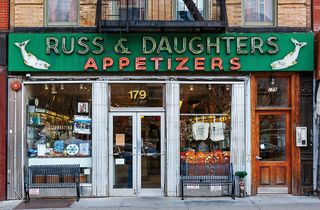
Karla: Our favourite neon sign in all of New York City is probably Russ & Daughters Appetizers.
We love it because it's two-tone neon with green and red, then the two fish are different colours. It's a sturgeon shop, basically, and the word 'appetizers' - which we found out when interviewing the owner, Niki Russ Federman - may have been invented by her family as a way to delineate what they were selling in the store. James: I also want to mention Katy's, a candy store out on the West Side, which is a really tough area.
The owner was Katy Keyzer, a massive woman with a booming voice. I like the way the sign is hand-painted with her name in the centre, above 'Candy Store'. It's a sad story because she was forced to close the store - Katy's was like a pillar of the neighbourhood.
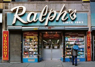
Photos in your book can do more than photos on your wall.
But what good can an image really do?
Karla: New York is always changing and we're not trying to make New York a museum; we're not trying to say that all these stores should stay exactly where they are. But for us, bringing the photos to light is an artistic intervention, to give back to our community and to the city that we love. And that's important.
These stores are ad hoc community centres and are so important to neighbourhoods. And because a lot of them were established to provide goods or services that locals would get back in their old homelands, they define the neighbourhood - whether it's lox [brined salmon] from Eastern Europe, or homemade mozzarella from Calabria in Italy. James: The photos in the book show people that there's a way to make a difference.
Get out there, get away from the computer, go out in your local neighbourhood and make some friends. Karla: It's important that if you want to save a store wherever you are, in whichever country, and you feel strongly about a mom-and-pop store, then go to it and shop there. Ordering something online from a big box retailer doesn't help anyone - it doesn't help the community, it doesn't help the local stores.
When I say ad hoc community centres they're even more than that, because these little mom-and-pop stores generally employ people from the community. So it's a full circle and you make a friend, like when you go into a coffee shop. We had our favourite coffee shop, which goes back to another favourite photo, Cup & Saucer.
Sadly it has closed now, but the owner knew us and he would see us coming over from across the street and our coffees would already be on the counter; we didn't have to ask for them.
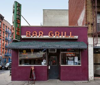
Have your images on social media inspired any people to do their own localised versions?
Karla: That's happened already, despite us being late to Instagram. We were initially a little hesitant about sharing our photos on it because of proprietary issues. But then we realised that it's more important to get the message out there rather than be worried about whether our pictures will be used by someone else without our permission.
Lots of people have taken on the project and we're happy about that; we've given workshops where we've taught students - not how to take a photo but how we began this project, the best ways we found of taking photos of mom-and-pop stores over the years, how to develop a style and how to approach the store owner if you're going to interview them.
So you're really keen for other people to shoot a project like this in their local areas?
Karla: Oh, most definitely! And we encourage that because we realised that this is something that's going on worldwide because of development. And also when development happens, it seems to be like there's a homogenisation of the appearance of the storefronts, and a lot of new stores that are constructed in new developments are characterless.
I mean sometimes there are no windows so you don't even know what's being sold inside; it's just like a little box that has no product displays. The sign is minuscule and you don't even know what's really going on in there.
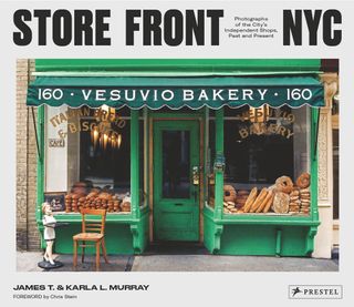
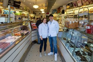
Meet the owner #1: Niki Russ Federman, Russ & Daughters
When does the current frontage and interior date from?
Niki Russ Federman: Shortly after WWII, when my great-grandfather took over an adjacent storefront to enlarge his humble store. If you think our shop is small now, it was half the size back then.
We have completed several renovations over the generations. But any time we need to do work on our shop, the objective is that the result should look as close as possible to the original.
What do you think the store's frontage says to anyone unfamiliar with it?
Niki: The combination of our large neon sign, which dates back to the 1960s, hanging above the two large window frontages that display some of the bagels, smoked fish and dried fruit we have inside, is a constant presence. It's a visual landmark of New York City, in large part, simply because it has been there for so long.
Why is it so important to try to preserve local stores?
Niki: These storefronts are so important to the psyche, identity and joy of what it means to be a New Yorker.
They are physical and visual representations of the people who work, shop, coexist and come together in these places of commerce, of exchange. They embody the expansive diversity and realness of life in New York City with all of its grit and challenge, patina and resilience. Each one is unique, and each one together builds the landscape and symphony that is this bustling collection of humanity, creativity and hustle.
Each city has its own collection of these places. And that's what makes, in this case, New York, New York, because these storefronts are ours. These spaces are ours and you don't find them anywhere else.
Is the publication of the Murrays' second book on this subject timely?
Niki: The story of New York City has always been one in which there is a tension between preservation and development.
The word 'development' is misleading because it implies progress and an inherent betterment of what was already there. Fundamentally, as a city and as a society, we need to put greater emphasis on doing both and appreciating both, preserving the spaces and markers of our history and shared experience while also making space for new construction. It should not be one or the other.
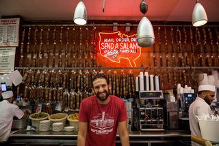
Meet the owner #2: Jake Katz, Katz's Delicatessen
When does the current frontage and interior date from, and has there been much renovation over the years?
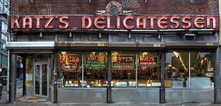
Jake Katz: Katz's Delicatessen has been around since 1888 with the last renovation being completed in 1949.
We have stayed true to that original design over the years, limiting our renovation to the bare minimum. A table here, a tile there, but never deviating from the true essence of what makes this place so special.
As a first impression for any passers-by who might not have seen it before, what do you think the store's frontage says to them?
Jake: Our unique frontage has always been a mainstay of the Lower East Side, with generations of deli-goers finding comfort in the never-changing vertical and neon signs. The bright lights complement the wonderful smells and help attract customers from all over our great city.
Store Front NYC pictures the heritage that the city has been losing, due ?to both family retirement and redevelopment.
Why is it so important to try to hang on to local stores?
Jake: Part of what makes New York City so unique is its constant growth and evolution. However, it is important to maintain pockets of heritage sprinkled throughout this dynamic landscape. By maintaining our look and feel, we can hold on to some of that distinct 135-year-old history here at Katz's Deli.
Given that redevelopment in your neighbourhood has been particularly aggressive in recent years, what good do you think the images in the book can do?
Would you say that makes the publication of Store Front NYC timely?
Jake: The reason we love this project so much is that we feel it is so important to capture these moments before they are lost forever.
We all know that storefronts and interiors won't last for future generations, but it is important to have a place to look back at what it once looked like.
Store Front NYC: Photographs of the City's Independent Shops, Past and Present by James and Karla Murray is published by Prestel Verlag.